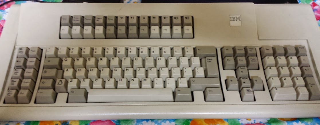
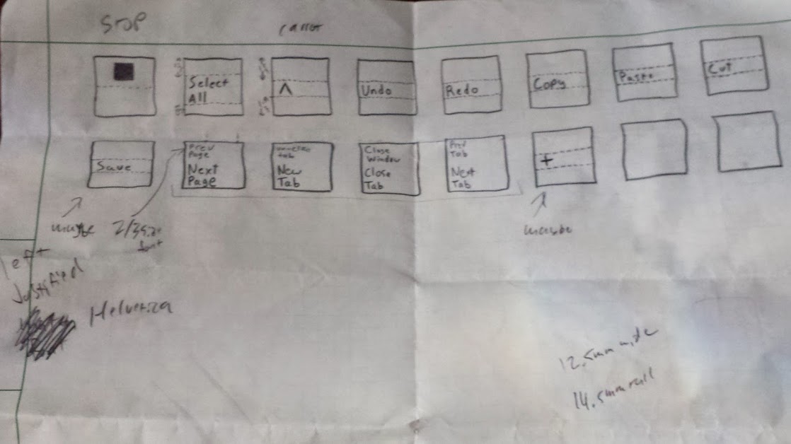
OK, I finally got around to doing those custom keys. They’re not the best, but I plan to do it better with what I have learned in the process of putting together this continuing adventure. Here’s my initial draft of key designs (I’m still looking to put a save key somewhere, not sure where though)
This part was completed at the fabulous i3Detroit hackerspace in Ferndale MI (of which I am currently a member). Previously I had hoped that I would just be able to mark the keys with the laser cutter, but predictably it just melted and didn’t actually discolor as I had hoped. I considered using the vinyl cutter to mask and then paint the keys, not fine enough. I could laser a mask out of something and paint it which I determined to be too much work. I could also use the laser to cut the keys and wipe paint into it, but all the examples for that show a smooth surface and not only are these keys curved, they’re textured. The easiest way to do it would be to use the laser to bond a paint to the surface, but I needed a ‘paint’ that would cure to the plastic and I could wash the rest of it away. Further experiments will be tried using conventional ceramic glaze, but today we had the right tool for the job: Thermark.
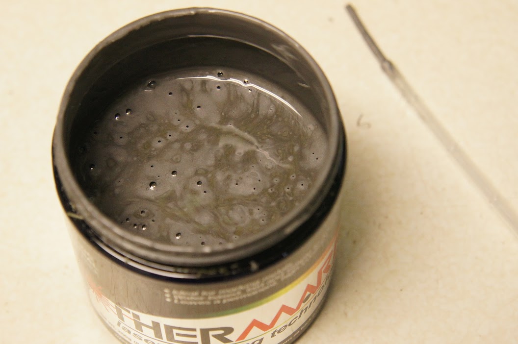
Thermark is a fantastic (and fantastically expensive) product that will bond to metal (and plastic as we discovered) with a relatively low power laser. Our first experiments were preformed on a sheet of polystyrene and apparently wildly out of focus because we were using power levels around 50% and today when I did it we couldn’t go above 30% for raster text. The first approach was to get the proper font (mostly Helvetica) for the keys and replicate them by rastering across the surface of the key and laying down a beam whenever that pixel should be darkened. That didn’t work. It sorta worked, and with much post-processing I’m certain we could make it work, I just don’t want to.
The laser cutter we’re using is the FullSpectrum HL40-5g 40 watt laser cutter and use software called RetinaEngrave. That software is both fantastic and terrible. To be honest it may have some of the features I want, but that just pushes it to a UI problem instead of a feature implementation problem. When you just want to cut something out, or draw a picture into a piece of material it’s fine. When you want to do fine detail work and have control over the laser for doing extremely fine (and low power) things like this it just doesn’t cut it. It may not be the computer-side software’s fault however, the controller in the laser cutter isn’t doing it’s job correctly either.
Verticals lost (before cleaning)

Verticals lost (after cleaning)
Some things we learned when making this keyboard: the laser takes time to warm up (and more importantly the controller isn’t compensating). That means if it’s been off for a second then there is a notable ramp up curve to the power output of the tube (do more expensive ones just use mirrors and leave the beam on the whole time?). This became a problem because The vertical lines would only blip on for the shortest time and the laser wouldn’t get up to full power. If there were any way to raster in the other axis on top of the same design to get a uniform pattern then it’d be fine but RetinaEngrave doesn’t do that. To fix this we tried slowing down the laser, but that melted the plastic in the parts where the tube was on for an extended period of time. We tried turning down the power as well but those two never seemed to balance and give us the consistency we wanted. There was then trying to stretch that axis (theoretically just telling the laser to turn on earlier) but that turned into a slightly bloated interior set of letters (which could be made to work, but I don’t really like that solution: I shouldn’t have to tweak the source material like that to compensate for the tool, I’d rather fix the tool). Finally we threw out the idea of rastering the font in favor of a nice vector font.

too slow, melted and pooled thermark (before cleaning)
too slow, melted and pooled thermark (after cleaning)
With a vector font we can get a longer beam-on time rather than blips and we can do a fill of the to get any size font we want. The downside is that I’d have to abandon Helvetica (I’ll be honest, by this point it was Mukti Narrow) for a more common Sans font. The promises of the Hershey Text from none other than Evil Mad Scientist Laboratories were great in their beautiful blog post about it. It delivered… sorta… eventually. First: the version you need is in eggbot_2013_08_11_2.3.4.zip not HersheyText_1.00.zip as it’s a script for the eggbot originally.

tried widening the letters, bled together a bit (before cleaning)

tried widening the letters, bled together a bit (after cleaning)
Once you’ve figured that out then you get to discover that our laser warm up problem has reared it’s ugly head again. When doing vector letters the first letter of a line would be too light, even the time it takes for the beam to scan back to the beginning of a line on a 12mm wide key has caused it to cool down and not be nearly as dark. The problem then with noticing it and doing just that key again is that if you only do one pass the tube still won’t have warmed up since it’s still the first letter. If you run a pass too light then try to make up for it with more passes you’ll run into the distinct non-linearity of the laser power. The hotspots on an initial light print will balloon out of control to splotches before you get the letter looking dark enough to be done. The key is the fewest passes to get the job done.
uneven application of thermark (before cleaning)
uneven application of thermark (after cleaning)
You need to actually run two passes over the first letter of each line in addition to running the rest of the cut. By the end I was doing two passes routinely since it does one cut, then repeats it rather than doing all of the cuts and starting over for another pass. There is also the concern that we’re not always in the most crisp focus since the keys are curved. I’m not all that concerned about that but it could be an alternate reason for the darkening problem (but the verticals problem in the raster letters seems to prove out my theory). The next time I do this I’m planning on manually editing the Hershey Text created lines to look more ‘Helvetica’. That being said by the time I got to the last 2/3 of the keys I had a process down. That process is detailed here:
1) First I traced (all of this in Inkscape) a nice rectilinear picture of a key that had some text in the same position as the text I wanted to mimic (single line, double line, single character, etc…) . To do this I laid down the snap-lines horizontally and vertically on the top and bottom of the text and the entire key.
2) Then I generated the vector font using Hershey Text.
3) I resized the font (after locking the ratio) to the size of the text on the key I wanted to replicate.
4) I resized (once again, lock those ratios!) the entire outline of a key with text group to be exactly 12mm wide (what I measured the key caps at).
5) Once I had the key the way I wanted it (all vector in this version) I printed it to RetinaEngrave.
6) In RetinaEngrave I disabled the outline (but a perimiter trace still goes around it so I can use that for alignment).
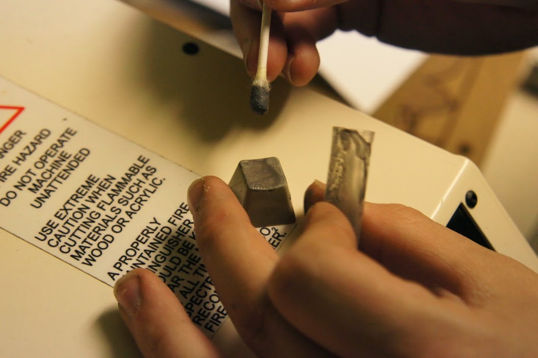
7) I placed the blank keycap (thermark applied with q-tip as evenly as I could manage) on a strip of masonite as a stand (the keycap isn’t level and I didn’t want to build a proper jig just yet).
8) Once aligned I fired a vector engrave with 0.2% power (tube doesn’t seem to come on if the software has it set any lower than that), 80% vector current % (because you can actually go lower) and two passes (to eliminate the dim letter problem). As far as we can tell the software won’t try to turn on the laser unless power is set to 0.2 or higher, less than that is possible with the vector current % setting, but not much below 50% of that (we used thermal paper as a test bed).
9) Wash with isopropyl alcohol (or honestly probably anything).
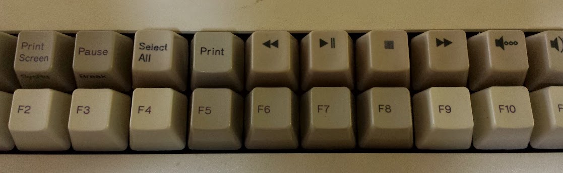
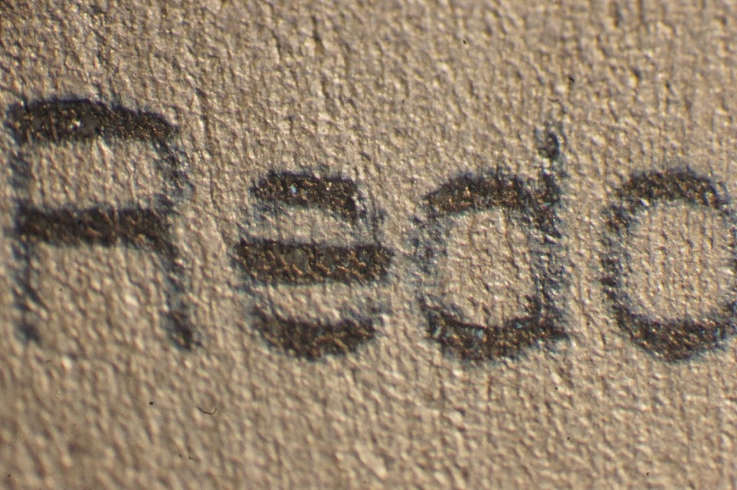
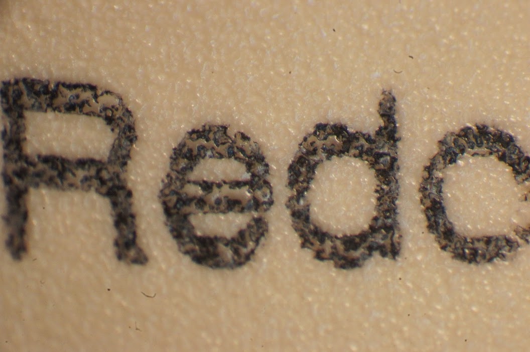
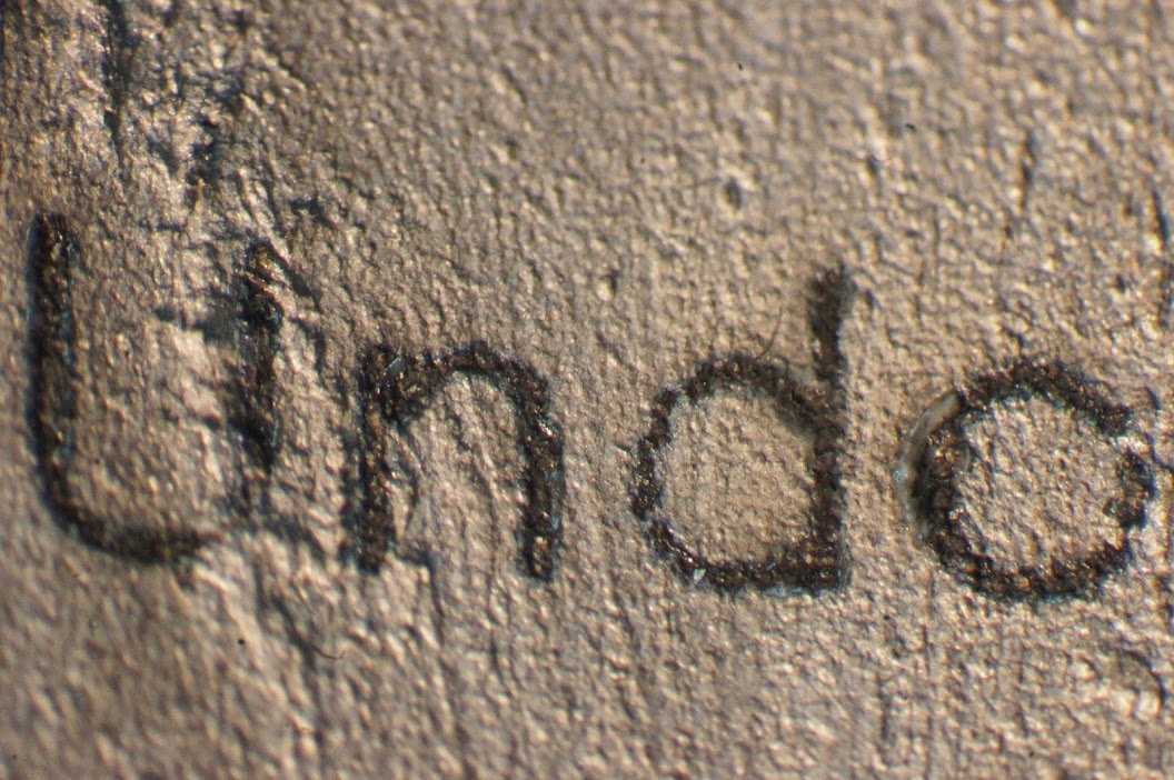
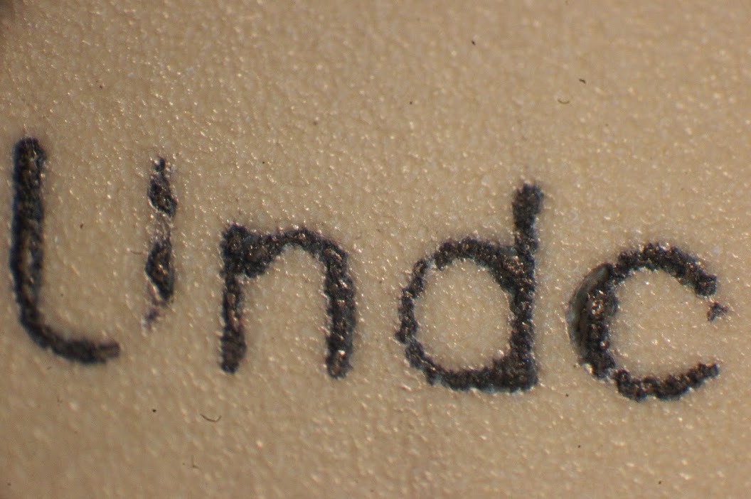
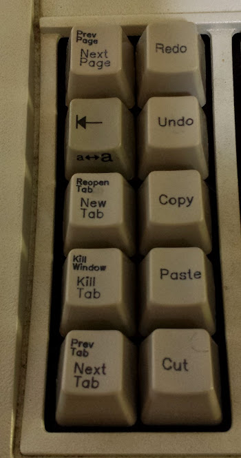
As you can see they’re not all straight, or uniformly placed, or uniformly dark… whatever, I’ll try again later. I personally think the method I have outlined here makes halfway decent keys. Redo is a raster one, the best we got it, we ran out of keys to test with otherwise it would have gotten the vector treatment too (and New Tab is done over a very light failed stop key (we really ran out)). A big thanks to Unicomp for still making these keycaps (and blank ones too)!
All the fantastic close up pictures were taken with a Sony a580 digital camera that had a custom adapter designed and 3d printed to fit our Nikon SMZ-2B binocular microscope. The the 3d model for that will be updated when I get it. Gallery with more up-close photos is here. My vector adventures are on git here and I have a post on th vinyl coming up.
